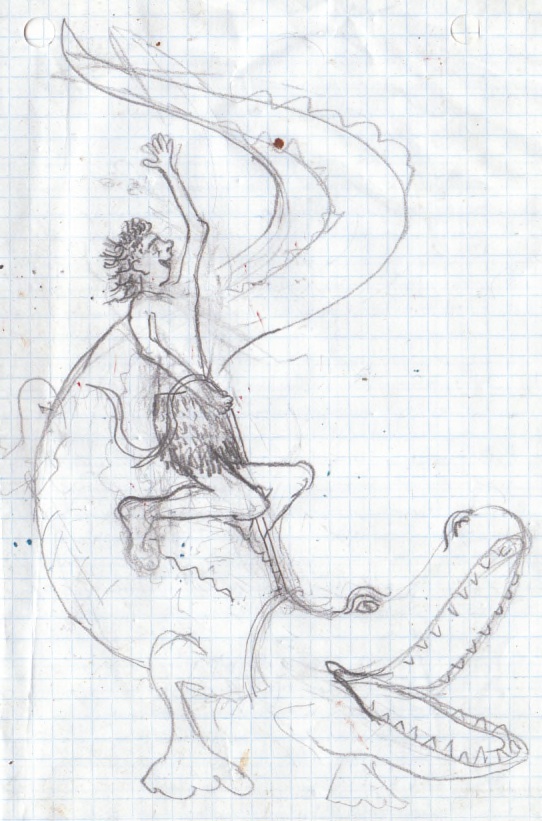
Digging through some old papers recently I found my original sketch for the illustration that became–in more capable hands than mine–the frontispiece for The Charlatan’s Boy. I thought you might find it interesting. Here’s a scan of my drawing (you can click on any of the images below for a more detailed look, by the way):

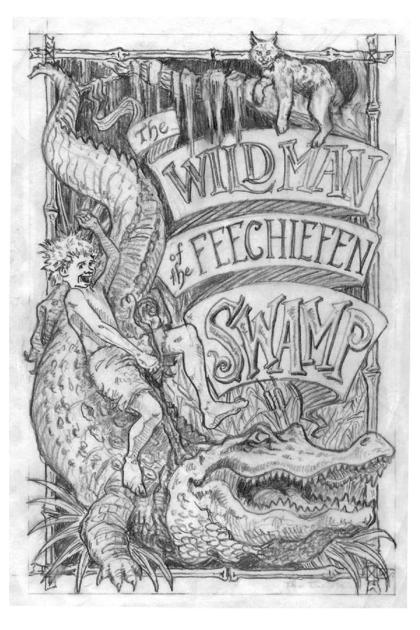
Not bad for an amateur, I don’t think, but not good enough for our purposes. Though I have harbored hopes of illustrating my own books, the picture you see above is really as good as I can do. So I sent this drawing to Abe Goolsby (who also illustrated The Bark of the Bog Owl, though not the other Wilderking books), and within a few days, Abe had sent me this:
I told Abe it looked great, but could he make the boy uglier–maybe with longer hair in the back, in the hairstyle the young people call a “mullet”–and change the cat from a bobcat to a panther? He came back with this:
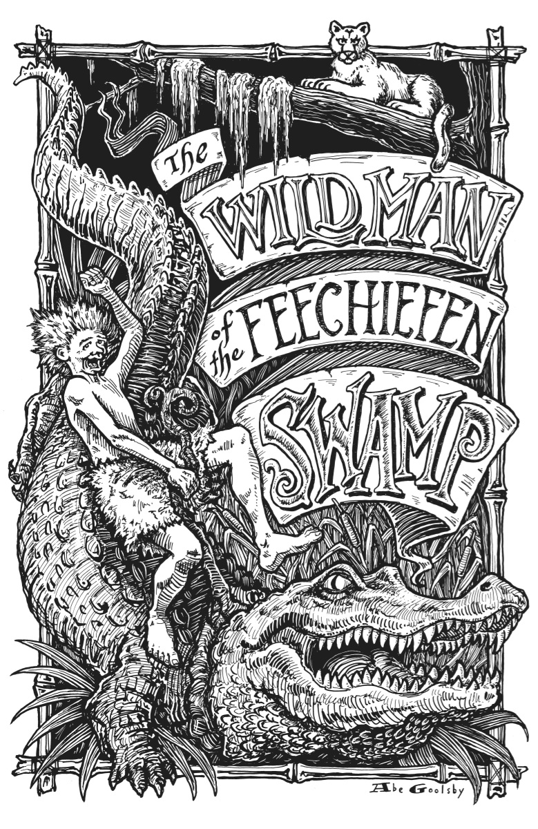
I told Abe, “Yow! That’s too ugly.” So he went back to the original ugly boy, put the whole thing on scratchboard, and gave us this frontispiece, which I am very, very proud of:
The moral of the story: leave the illustration to illustrators.
Bonus Illustration Tutorial: If any of you are aspiring children’s book illustrators, you absolutely have to know how to draw a penguin. Here’s a link to illustrator Oliver Jeffers’ tutorial, “How to draw…penguins.” The first step is “Borrow a penguin.” The advice gets more practical, but still funny.


livingoakheart
I am writing a children’s book and collaborating with my illustrator, who had a more ‘normal’ childhood than I. I started writing using photos of stuffed animals, so I really had no preconceived notions about what the illustrations would look like. This has worked out well, because she draws pictures and I say, “Wow! That is so much better than I even imagined.”I am not a very visual person.
Fellow Traveler
When I have something to look at and copy, I can draw with modest competence. But the moment I look at what my friends who are real artists can do, I too throw up my hands and say, “No way I can ever dream to be able to do that!”
Fellow Traveler
I’m afraid your crocodile didn’t look that fearsome either. 😉
Fellow Traveler
Deepest apologies… that should be ALLIGATOR, not crocodile.
sally apokedak
That’s what I noticed, too. Jonathan’s alligator looked all friendly and happy. The one Abe drew is positively glaring. It’s great.
Micah Hawkinson
It’s funny, isn’t it, how something as apparently simple as the arrangement of lines on a page can be so difficult to do well? And I say that as someone whose lines are never the way he wants them.
Also, for the record: I know it is probably in recognition of Our Nation’s Independence or Something, but I really missed APF this week… just sayin’. 🙂